Connected Chef
Timeline: late summer 2023
My role: Web Design Consultant for ConnectedChef.org
Project type: paid consultant


About
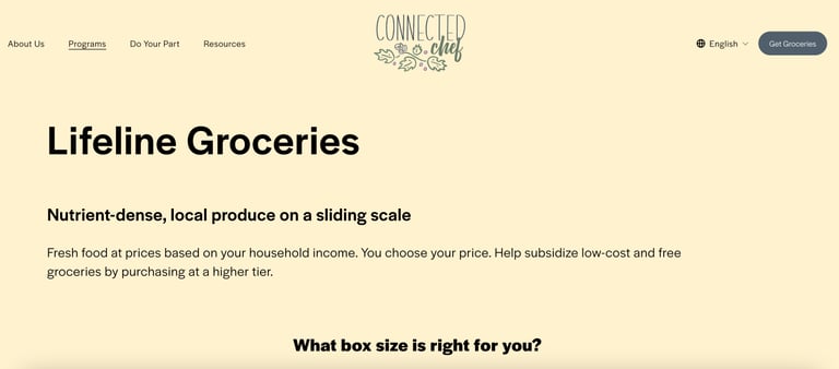
Connected Chef is a grocery subscription service available in Queens, New York. They are a nonprofit with a vision of a community-supported agriculture system. They offer Lifeline Groceries, which is a program that offers packages of fresh produce based on a sliding scale payment system, where users can select the price tier that aligns with their income, or users can apply to receive those packages of produce for free.
My client’s website did the job of letting people sign up for the grocery service, but it involved a confusing pathway that didn’t intuitively delineate options, and overall it felt more like a blog about a nonprofit than a platform to showcase and offer their Lifeline Groceries program. The value proposition of their product was clear to me once I understood it, but their website was not doing a good job of communicating it.
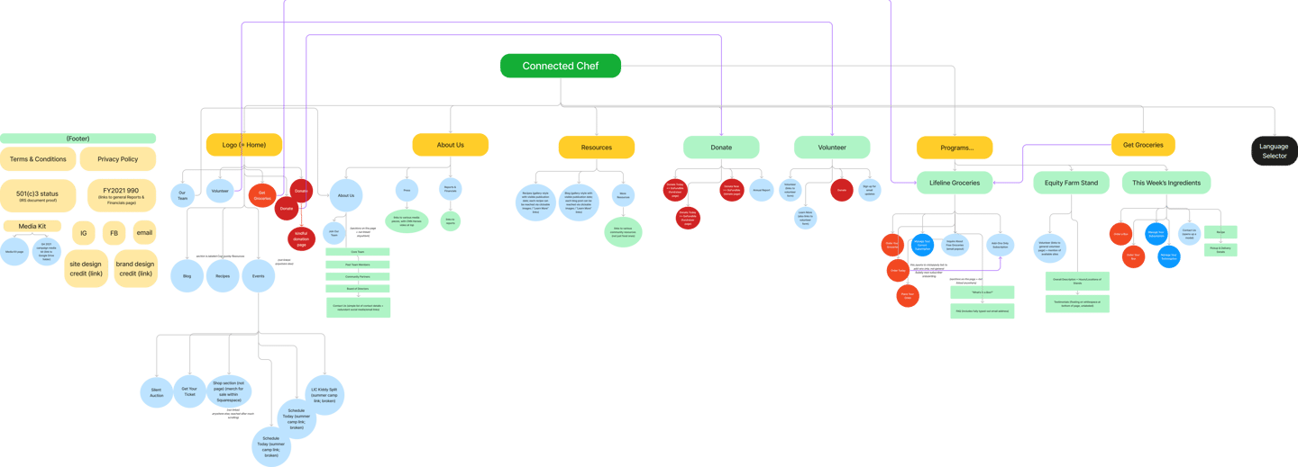
• they had a convoluted site map that made it hard to navigate around the site (e.g. unexpected linking direction based on the copy of some links, or inconsistencies as to whether the same item in the site menu was clickable or not, based on the page the user was on)
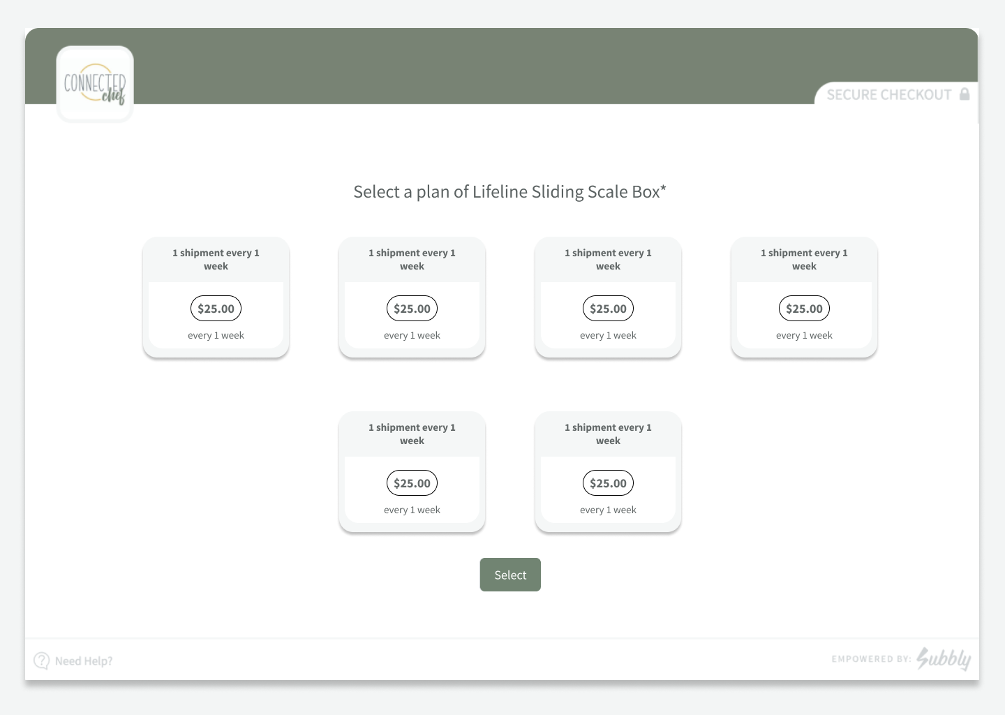
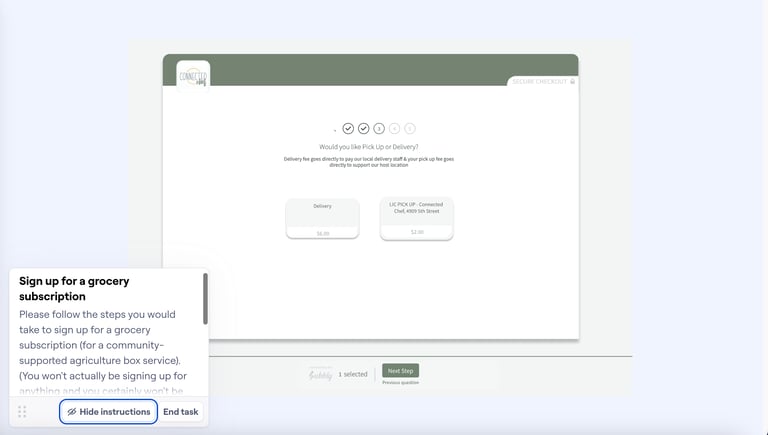
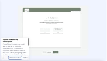
• the checkout process (managed by Subbly, a separate platform than the Squarespace site itself) had room for improvement because it required the user to make a lot of choices (not explained elsewhere on site) sequenced in a confusing order
Problem
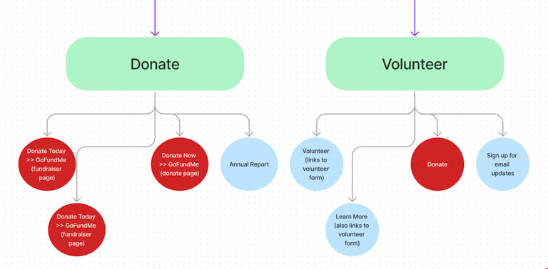
Note how within the Donate page, "Donate buttons" appear multiple times as the user scrolls, and with different copy for the button text, and sometimes taking the user to different pages. The same is true for "Volunteer" buttons on the Volunteer page.
However, I did not want to rely solely on the areas for improvement that I identified from exploring the website myself, because I also wanted my design process to be guided by the user feedback the Connected Chef was receiving most often, as well as the client’s goals, which were to give their website and branding as complete an overhaul as possible within the constraints of the short-term project budget.
Therefore, I decided to also target the pain points that, often, users:
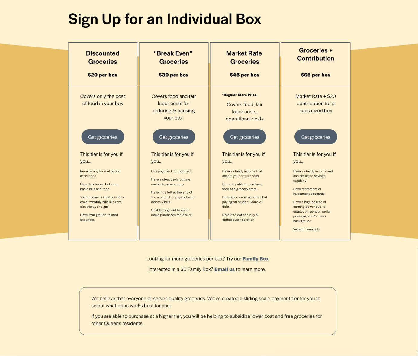
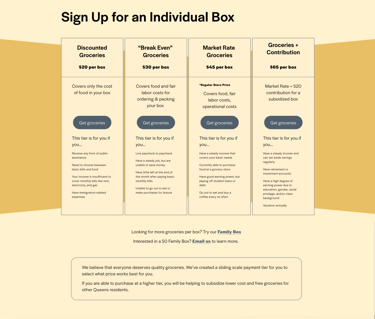
• didn’t understand the sliding scale payment model,
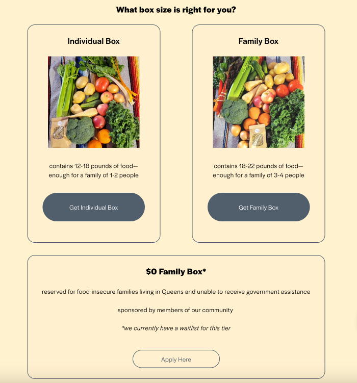
• didn’t know how much food to expect or what size package to order
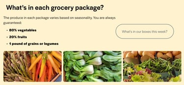
• didn’t know what types of foods to expect in each grocery package
Research & Synthesis
• I built a prototype of my proposed simplified checkout process and validated its improved clarity with test users.
• I built out content modules that showcased and clarified the value proposition and details of the program
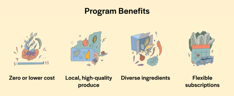
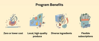
• I collaborated with a graphic designer the client hired to make custom design graphic icons describing the key benefits of their Lifeline Grocery program, to ensure they aligned with the color scheme of the website and would fit well within the webpage structure of the homepage
Outcome
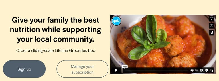
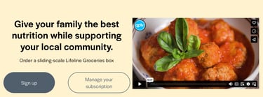
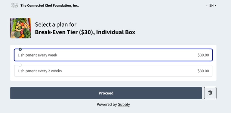
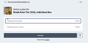
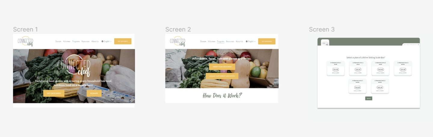
I helped the client elucidate the program options, using product cards to spell out each individual option in a chart format. This meant users were not forced to immediately start the Subbly checkout process (a one-step-at-a-time selection process) without first getting to visualize and understand the non-intuitive pricing scheme -- which is that your self-selected price tier determines the price per box, regardless of whether that box is the individual (half) box or family (full) box, and then you can independently choose how often you get shipments. They implemented my recommendation that they rearrange and alter the steps in the checkout flow based on user testing insights, so that now price selection takes place on their branded (Squarespace-managed) site. This is a major improvement because in that part of the user journey, the user benefits greatly from a chart comparing the price tiers. Also, in my improved user pathway, a lot of confusion is eliminated because users are no longer simultaneously selecting frequency and price tier in the same step.
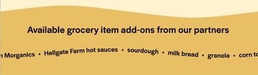
On the Squarespace site, I also established a design pattern of primary CTAs (buttons with a dark background) versus secondary CTAs (buttons with a transparent background), which helped create visual fluency and direct users through the primary sales funnel. I incorporated promotional videos and excellent new photography the client had taken, including photos of their produce in their grocery packages and farm stands, to illustrate what a typical Lifeline Grocery box might look like and to present some of the fresh seasonal ingredients included in recent shipments. I included client-approved language about the price self-selection process right at the top of the checkout process. Finally, I used a captivating animation to feature a text list of the available add-on items that subscribers can include in their grocery shipments, which highlighted the customizability of packages and advertised the local partners who provide the add-on items.